![Social Paws Branding]()
Social Paws Branding
![Social Paws App Design]()
Social Paws App Design
![Social Paws Brand Pattern]()
Social Paws Brand Pattern
![Social Paws Social Media Design]()
Social Paws Social Media Design
![Fashiers Branding]()
Fashiers Branding
![fashiers app_port.jpg]()
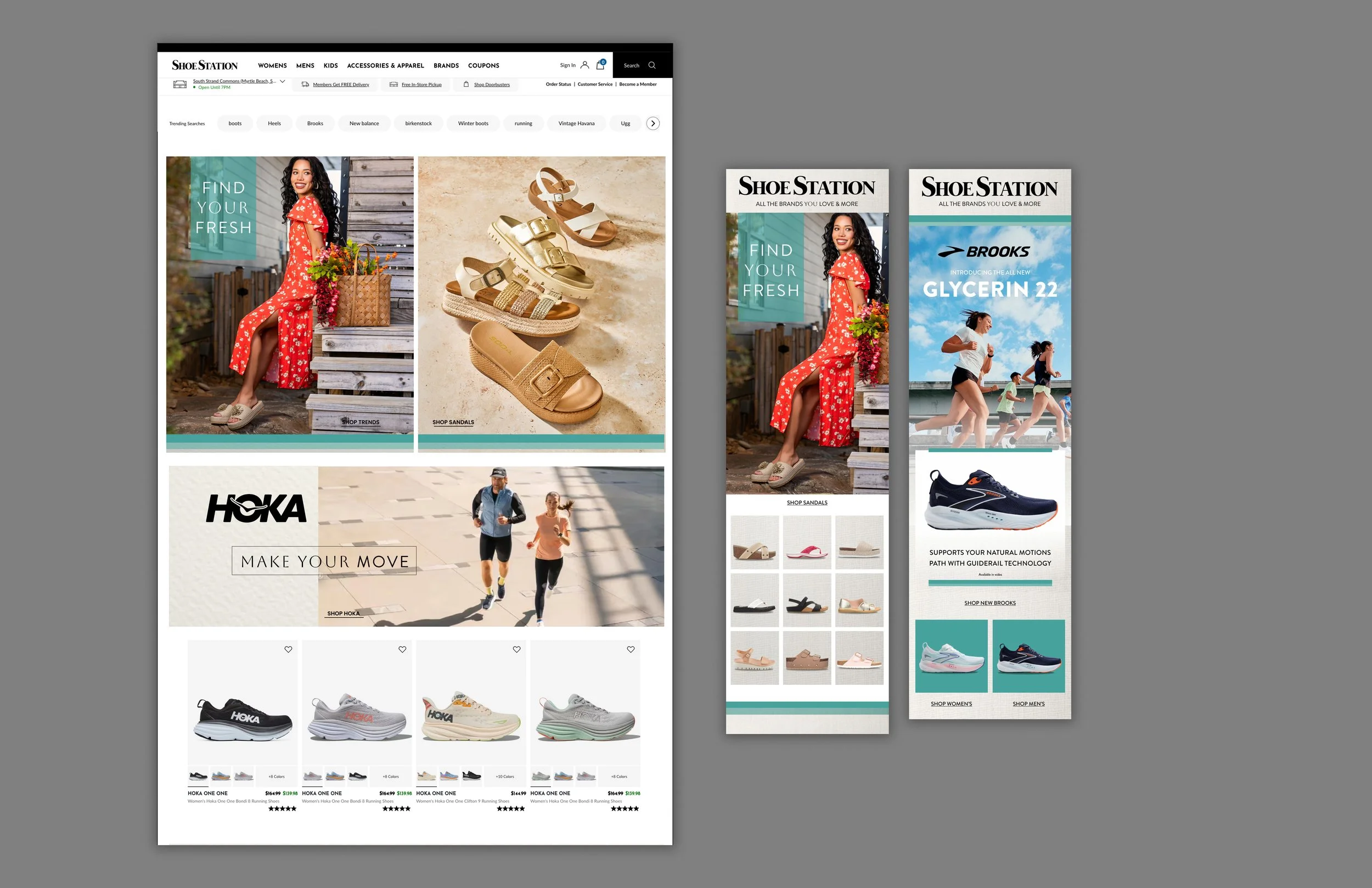
![Shoe Station]()
Shoe Station
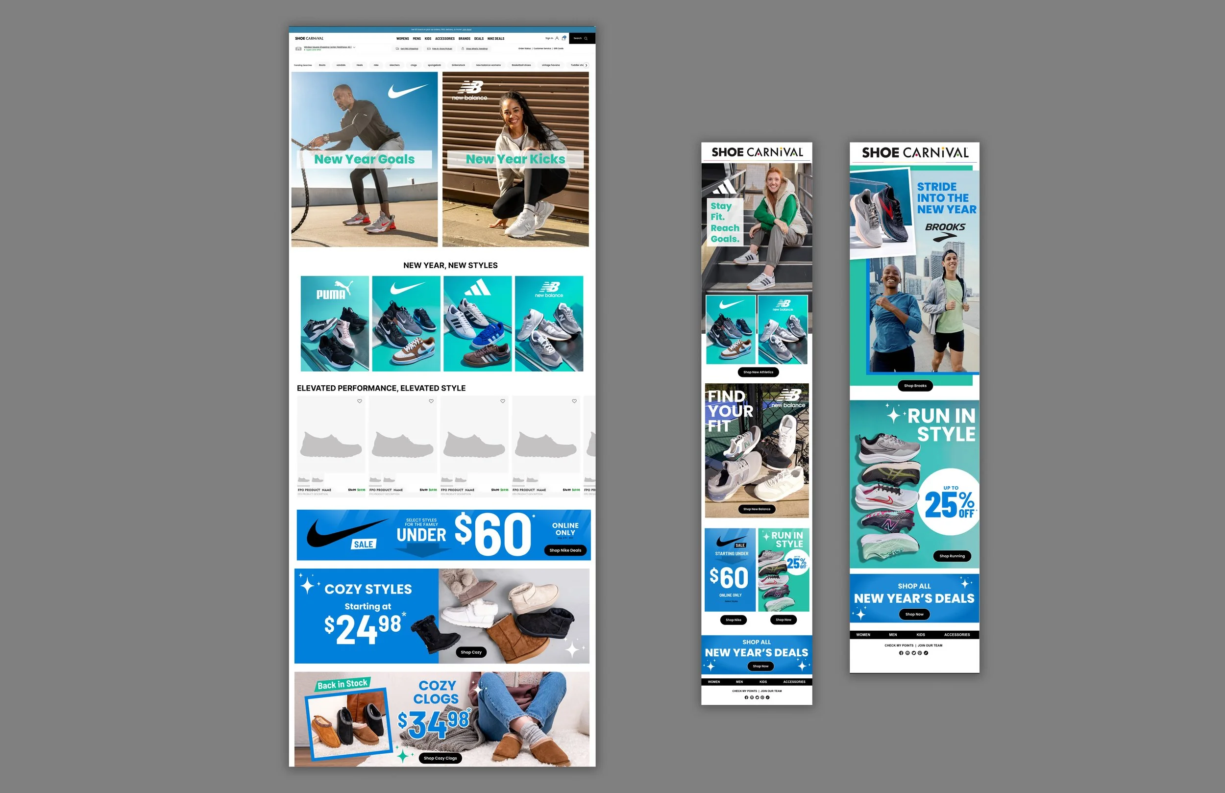
![Shoe Carnival]()
Shoe Carnival
![SensorDo Package Design]()
SensorDo Package Design
![Soft-Tex Website]()
Soft-Tex Website
![True Craft Branding]()
True Craft Branding
![IMG_9629.jpg]()
![tc webpage.jpg]()
![Lightning bug branding]()
Lightning bug branding
![IMG_8916.jpg]()
![IMG_8914.jpg]()
![Screen Shot 2019-01-29 at 9.29.17 PM.png]()
![The Ability Experience Social Media Campaign]()
The Ability Experience Social Media Campaign
![Red Camel Branding]()
Red Camel Branding
![Red Camel Mens Branding]()
Red Camel Mens Branding
![Screen Shot 2020-07-06 at 1.50.31 PM.png]()
![Social Paws Branding]()
Social Paws Branding
![Social Paws App Design]()
Social Paws App Design
![Social Paws Brand Pattern]()
Social Paws Brand Pattern
![Social Paws Social Media Design]()
Social Paws Social Media Design
![Fashiers Branding]()
Fashiers Branding
![Shoe Station]()
Shoe Station
![Shoe Carnival]()
Shoe Carnival
![SensorDo Package Design]()
SensorDo Package Design
![Soft-Tex Website]()
Soft-Tex Website
![True Craft Branding]()
True Craft BrandingTrue CraftTrue Craft is a lifestyle brand that was created to be used in all areas of apparel, accessories and shoes. The price points were mid range. This brand had to be appealing to everyone at all ages. The brand was based in denim. At the start of the design and strategy process we researched all of the brands in the marketplace and we understood that we had this customer. Our internal data was clear that if we created it - they would come. We researched vintage styles for the aesthetic. The usage of color was to be minimal as I understood this brand was going to have to be mixed with color as well as feel worn. I chose a beige and brown combo with a stained feel for the branding. Our language - original handcrafted and southern design was a used so the customers would know this was designed in the South. The TC locking logo was created as a secondary element so I could use it on apparel buttons and shirts as a secondary branding element. The advertising was photographed in the Southern places and have green spaces to feel fresh. The copy ( an invitation to take the road less traveled, dream big and own your path) was based on the freedom to choose your own direction. Youthful and free. The in-store displays mirrored the aesthetic and used simplified information about the product types for a quick understanding of the offerings.True craft is heritage brand. A brand that makes anyone feel young. A brand that if comfortable for all.
![IMG_9629.jpg]()
![tc webpage.jpg]()
![Lightning bug branding]()
Lightning bug brandingLightning BugLightning Bug was created with kids in mind. We were looking for a brand that could fit the needs of the entire lifestyle of kids from toddler to 10. The journey was to come up with a brand that would resinate with the South. We loved how the name lighting bug was playful but accurate for the South. Kids love to collect and put lighting bugs in a jar and see how they light up. Kids light up with happy expression and the parallel fit. Not to mention the are cute. My strategy was to create brand guidelines to use only simplified gender and neutral colors so the design could live in every area of business - as well as have longevity. The bug was hand drawn and then create in the computer. The shape of the tag and design was circular to capture the shape of the lightning bug. The advertising was vibrant and happy utilizing the patterns of the bedding prints to enhance the overall aesthetic. The lighting bug was used for the apparel as well as the bedding for more brand integration. The in-store visual was designed to be placed in the kids area as a one stop shop. The parents can come in and see all of the elements in one place and not have to visit different areas of the store.
![IMG_8916.jpg]()
![IMG_8914.jpg]()
![Screen Shot 2019-01-29 at 9.29.17 PM.png]()
![The Ability Experience Social Media Campaign]()
The Ability Experience Social Media CampaignThe Ability ExperienceI work with The Ability Experience on branding for their events. The Ability Experience is a non-profit that is the main philanthropy outlet for Pi Kappa Phi. They work with people with disabilities and host many events throughout the country. I created many full scale branded campaigns for them that include: Apparel design, website design, social media, signage and product design. The example is for the say thanks campaign. They wanted to share with the donors thanks for their support during the last year. We used statements of encouragement that were submitted and created a design that had a bright energy for the campaign. There were a series of posts for the campaign.
![Red Camel Branding]()
Red Camel BrandingRed CamelRed Camel is a junior lifestyle brand that we wanted to extend to the bras segment. At the time this brand was in many areas of this business and this was a new segment. The fun, flirty and feminine girl that wanted to have cute, current and comfortable bras and accessories. The flower element was used to bring out the sweetness of the juniors. The flower was based on a vintage floral I found and recreated from 1920. The design was printed on canvas to give the softer feel to the brand. The camel was originally used and was brought back as a simplified design. I wanted it to be clean and recognizable but partner with the floral. The pink, yellow and green makes it feel like spring time.We utilized the camel on the bras as well and used variations of the floral in the inside neckline of the apparel.
![Red Camel Mens Branding]()
Red Camel Mens Branding
info
prev / next
1
2
3
4
5
6
7
8
9
10
11
12
13
14
15
16
17
18
19
20
21
·
·
·
·
·
·
·
·
·
·
·
·
·
·
·
·
·
·
·
·
·


